在现代设计趋势中,骨架屏风是留住访客不可或缺的一部分。他们通过让用户了解页面内容的状态来创造速度的错觉并管理用户的期望。骨架屏幕提供的最重要但被低估的解决方案之一是它们有助于避免累积布局偏移 (CLS),允许内容在加载时一次性显示,而不是按顺序显示。
准备好通过在您自己的项目中实现骨架屏幕来使您的界面更加直观和富有表现力了吗?以下是如何开始。
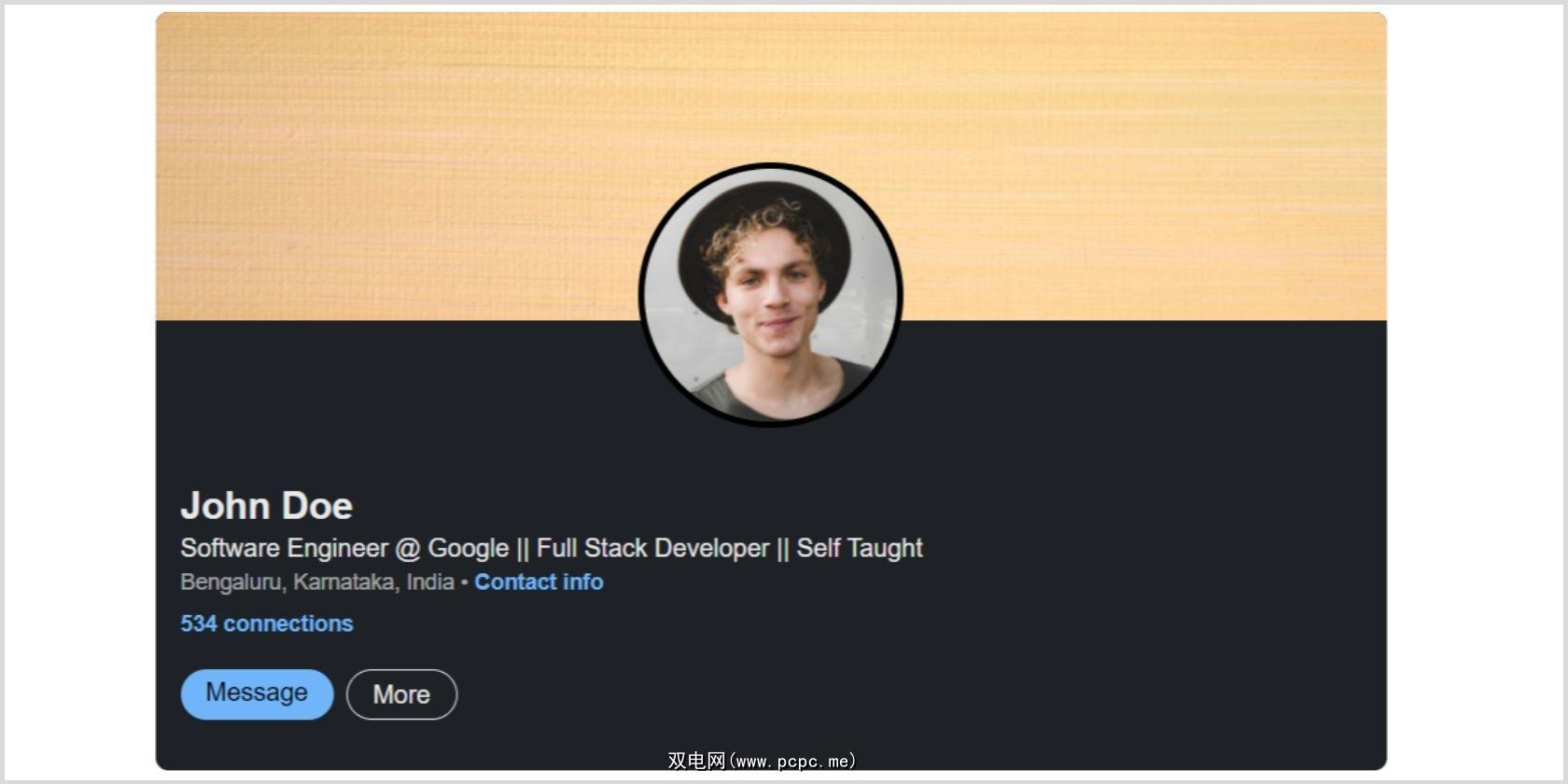
设计网页布局可以帮助您明确您的期望。您应该设定目标、定义布局、添加任何所需的页面,并使其可访问并响应不同的屏幕尺寸。现在,考虑一个带有封面图片、个人资料图片、一小段文字和号召性用语按钮的简单设计。
使用纸张或 Figma 或 Adob??e XD 等应用程序起草布局设计后,就该准备 HTML 结构了。
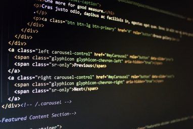
创建一个新文件index.html并为父<div> 中的布局编写一些 HTML,其中class=”profile-container”。为每个元素添加class="skeleton"以应用骨架屏幕加载效果。当使用 JavaScript 加载内容时,您将删除此类。
注意:不要忘记在index.html文件的标题中链接 CSS 和 JavaScript文件。
<head>
<meta charset="UTF-8" />
<meta http-equiv="X-UA-Compatible" content="IE=edge" />
<meta name="viewport" content="width=device-width, initial-scale=1.0" />
<link rel="stylesheet" href="style.css" />
<title>Skeleton Screen Loading Effect</title>
</head>
<body>
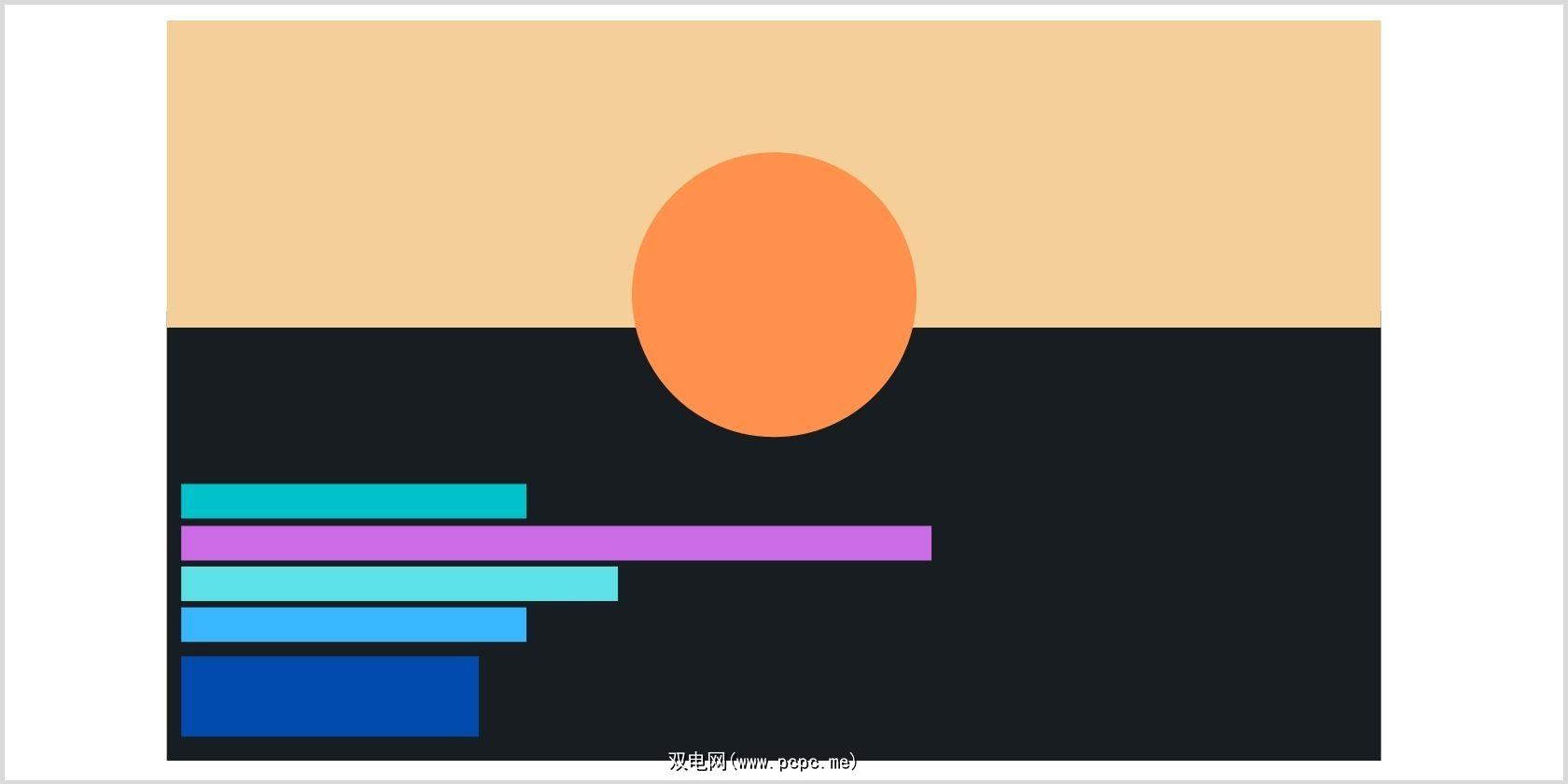
<div class="profile-container">
<div class="profile-images">
<div class="cover-img skeleton">
<img class="lazy" data-original="./image/linkedin banner.jpg">
</div>
<div class="profile-img skeleton">
<img class="lazy" data-original="./image/user-profile.jpg" alt="Photo by Ian Dooley on Unsplash">
</div>
</div>
<div class="profile-text">
<h1 class="skeleton">John Doe</h1>
<p class="skeleton">Software Engineer @ Google || Full Stack Developer || Self Taught</p>
<h5 class="skeleton">Bengaluru, Karnataka, India ? <a class="skeleton" href="/">Contact info</a></h5>
<p class="skeleton"><a class="skeleton" href="/">534 connections</a></p>
</div>
<div class="profile-cta">
<a class="message-btn skeleton" href="/">Message</a>
<a class="more-btn skeleton" href="/">More</a>
</div>
</div>
<script class="lazy" data-original="script.js"></script>
</body>
在整个正文中应用基本的 CSS 属性,例如margin、font-family和color。
body {
 margin: 0;
 font-family: Arial;
 color: rgba(255, 255, 255, 0.9);
}
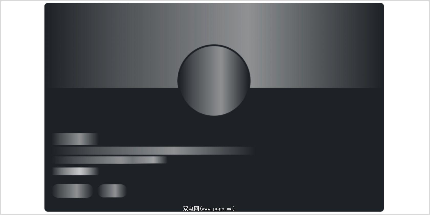
要添加加载效果,请向骨架类添加一个::after 伪元素,该类从左 (-100%) 到右 (100%) 移动一两秒钟,从而产生微光动画。
.skeleton {
 position: relative;
 width: max-content;
 overflow: hidden;
 border-radius: 4px;
 background-color: #1e2226 !important;
 color: transparent !important;
 border-color: #1e2226 !important;
 user-select: none;
 cursor: default;
}

.skeleton img {
 opacity: 0;
}

.skeleton::after {
 position: absolute;
 top: 0;
 right: 0;
 bottom: 0;
 left: 0;
 transform: translateX(-100%);
 background-image: linear-gradient(
 90deg,
 rgba(255, 255, 255, 0) 0,
 rgba(255, 255, 255, 0.2) 20%,
 rgba(255, 255, 255, 0.5) 60%,
 rgba(255, 255, 255, 0)
 );
 animation: shimmer 2s infinite;
 content: '';
}

@keyframes shimmer {
 100% {
 transform: translateX(100%);
 }
}
现在,让我们为个人资料和封面图片设置样式。不要忘记设置溢出:隐藏;以避免任何不一致。
img {
 width: 100%;
 vertical-align: middle;
}


.profile-container {
 width: 95%;
 max-width: 780px;
 margin: 0 auto;
 border-radius: 8px;
 margin-top: 32px;
 background-color: #1e2226;
 overflow: hidden;
 position: relative;
}

.cover-img {
 width: 100%;
 overflow: hidden;
 background-color: #1e2226;
 aspect-ratio: 4 / 1;
}

.profile-img {
 border-radius: 50%;
 width: 160px;
 height: 160px;
 border: 4px solid #000;
 background-color: #1e2226;
 margin: 0 auto;
 position: relative;
 overflow: hidden;
 bottom: 100px;
}
为确保您的设计在不同屏幕上具有响应性,请相应地应用媒体查询。如果您是 Web 开发的初学者,您应该学习如何在 HTML 和 CSS 中使用媒体查询,因为它们在构建响应式网站时非常重要。
@media (max-width: 560px) {
 .profile-img {
 width: 100px;
 height: 100px;
 bottom: 60px;
 }
}
通过设置margin、font-size和font-weight来设置文本样式。您还可以根据自己的喜好更改文本颜色、添加标题、段落或锚<a>标签。向锚标记添加悬停效果很有用,因为它可以让用户了解链接。
.profile-text {
 margin-top: -80px;
 padding: 0 16px;
}

.profile-text h1 {
 margin-bottom: 0;
 font-size: 24px;
 overflow: hidden;
}

.profile-text p {
 margin: 4px 0;
 overflow: hidden;
}
.profile-text h5 {
 margin-top: 4px;
 font-size: 14px;
 margin-bottom: 8px;
 font-weight: 400;
 color: #ffffff99;
 overflow: hidden;
}
.profile-text a {
 color: #70b5f9;
 font-size: 14px;
 text-decoration: none;
 font-weight: 600;
}

.profile-text a:hover {
 color: #70b5f9;
 text-decoration: underline;
}
号召性用语 (CTA) 很重要,因为您通常希望以某种方式转换用户的访问。给它一个容易引人注意的颜色将有助于你的 CTA 在页面上脱颖而出。
.profile-cta {
 padding: 16px 16px 32px;
 display: flex;
}
.profile-cta a {
 padding: 6px 16px;
 border-radius: 24px;
 text-decoration: none;
 display: block;
}

.message-btn {
 background-color: #70b5f9;
 color: #000;
}

.more-btn {
 color: inherit;
 border: 1px solid rgba(255, 255, 255, 0.9);
 margin-left: 8px;
}
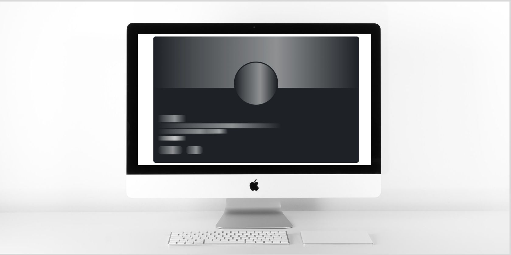
输出:
现在您已经使用 CSS 添加了前导效果,是时候使用 JavaScript 将其关闭了。默认情况下,动画将重复无限次,但您希望它只运行几秒钟。您可以使用setTimeout将时间设置为 4000 毫秒。它将在 4 秒后从所有元素中删除骨架类。
注意:确保在<body>部分的末尾添加<script class="lazy" data-original="script.js"></script>。
const skeletons = document.querySelectorAll('.skeleton')
skeletons.forEach((skeleton) => {
 setTimeout(() => {
 skeleton.classList.remove('skeleton')
 }, 4000)
})
输出:
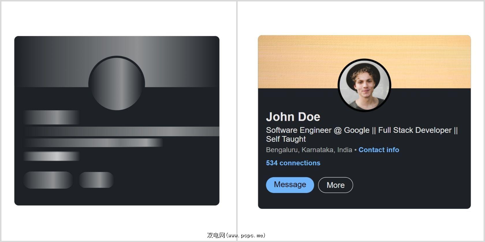
您已成功使用 HTML、CSS 和 JavaScript 创建了骨架屏幕加载效果。现在,每当有人从服务器请求新内容时,您都可以在加载数据时显示骨架屏幕加载效果。它越来越成为一种流行的设计趋势,您可以在 Google、Facebook 和 Slack 等网站上看到它。
同时,如果您不熟悉 JavaScript,您可以通过了解 JavaScript 以及它如何与 HTML 和 CSS 交互来学习基础知识。